This is based on a repository of UCI Machine Learning Repository.
This article was written as part of a Data Science Master task.
When a person loses high blood from an accident, operation, or has health problems, they may need to receive a blood transfusion.
However, since human blood is a substance that cannot currently be manufactured, it is necessary to obtain it from another person, i.e. a blood donor.
It would be good to have a way of predicting which people are most likely to donate blood to them, so then those people could be contacted. You can just call everybody, but what if you had millions of clients? Saving time in useless calls might just save lives. To help in this area, it would be interesting to get away to predict which people are most likely to donate blood so that those people can be contacted at times when there are high needs or low reserves. This could be a way to optimize efforts to prioritize calls to donors most likely to be available.
Importing data
We are using the Blood Transfusion Service Center Data Set, available at the UCI Machine Learning Repository. This dataset consists of the donor database of Blood Transfusion Service Center in Hsin-Chu City in Taiwan. The centre passes their blood transfusion service bus to one university in Hsin-Chu City to gather blood donated about every three months in March 2007, with 748 donor rows, each one included :
- Recency – time since the last donation (months);
- Frequency – total number of donations;
- Monetary – total blood donated (cubic centimetres),
- Time – time since the first donation (months); and
- Target – represented here by the binary column stating whether a donor in the database has donated blood in March 2007 (1 = yes, 0 = no).
Data exploration
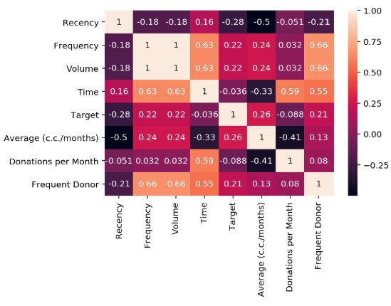
No null data is observed in this dataset for any characteristic. Now you can check the correlation that exists between the different characteristics.
Information can be presented in a more visual way using heat maps.
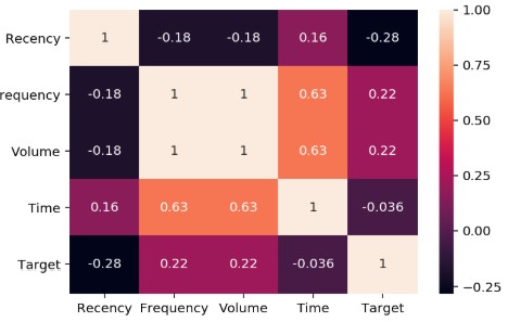
A strong correlation is observed between the Frequency and volume of donated blood. A high frequency between Time and Frequency and Volume can also be observed.
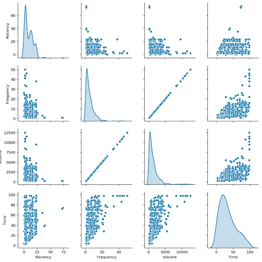
Another way to visualize the data and render all against all to check the correlations.
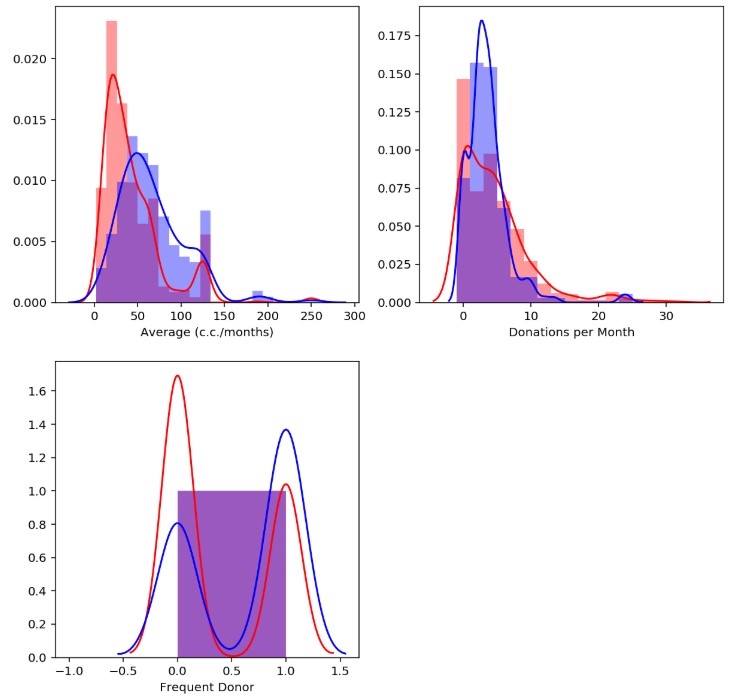
Histograms
To analyze the effect of each of the different characteristics on whether or not blood donors donate in that year, histograms can be used. To do this, we will create a function that represents the distribution of current donors based on the characteristics. In red it represents those who did not donate and in blue those who donated.
First, it can be applied to Recency, the time elapsed since the last time I give blood. Second, the Frequency can now be analyzed. Then, it can also be studied how blood volume relates to probability and finally, you can study how long you’ve been a donor.
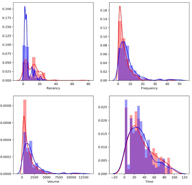
You can note as you would expect, that the longer you have donated (Recency) there is a better chance that the donor doesn’t donate blood this year. In the Frequency the only thing that can be noted is the fact that those who donate less frequently are less likely to donate this year. Lower Volume indicates lower probability, similar to the Frequency. In the last case, a clear relationship cannot be observed.
Creating new features
In order to create better models, we can proceed to the creation of new features in the hope that these can be more predictive. For example, you can create the average volume donated each time or the average occasions that have been donated per month. we also generate another boolean variable if the frequency is greater than the mean.
Analysis of news features
Once the new features are created, the initially performed analysis can be repeated. Correlation can be checked.
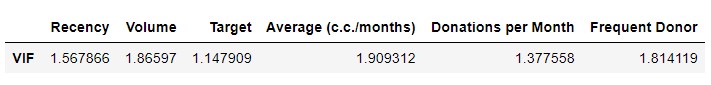
Elimination of collinear features
We can use VIF (Variance inflation factor) method.

It can be seen that there is large multicollinearity between the different characteristics of the model. In fact, there are two features with Infinite VIF, indicating perfect multicollinearity. You can use the algorithm to select only those that have a VIF less than 5.
We note that the Target variable will be our dependent variable so it should remain in the data frame.
Modeling
Before proceeding to the creation of models knows how to divide the dataset is a training set and a test set.
Basic Model (Dummy Classifier)
As a starting point, two simple classifiers were used to classify donors based on the raw data set. The first one we use as a reference is a dummy classifier, a simple scikit learning classifier that produces a random result, this is useful for comparing it to the other models.
The performance of the model is: 0.55080
Logistic regression
The first model to evaluate will be logistic regression. In this model, you will only use to modify the number of characteristics used. First, a Pipeline is created as a standard process.
The performance of the model is: 0.70053
The forecast for this model is 70%. This is a reference point for the following models. Now you can check if the model can be improved by changing the number of features used.
The performance of the model is: 0.71123
{'kBest__k': 4}
It can be seen that the model improves slightly from two characteristics to four.
Random Forest
The next model used will be Random Forest. For this classifier, you will test how it affects the number of estimators and the maximum depth of the trees used. Like the previous case, a standard Pipeline is initially created.
The performance of the model is: 0.72193
The initial performance of the model is 72%. You can now prove that it happens when you modify the settings.
The performance of the model is: 0.78075
{‘kBest__k’: 3,
‘rf__max_depth’: 4,
‘rf__n_estimators’: 25,
‘rf__random_state’: 0}
Cross-validation results in a configuration that allows for better models than the first one.
Support Vector Machine (SVM)
Finally a Pipeline is created for the support vector machines.
The performance of the model is: 0.70053
The initial yield is 70%, which is lower than the previous model. Let’s see what you can get by modifying the settings.
The performance of the model is: 0.75401
{‘kBest__k’: 2,
‘svm__C’: 10,
‘svm__gamma’: 0.001,
‘svm__kernel’: ‘rbf’,
‘svm__random_state’: 0}
The model improves considerably but still not better than it was previously with Random Forest.
Model optimization
Let’s take a more spin and apply to the data normalization and rescale of the data, generating new polynomial variables from the existing numerical ones using the preprocessing library. PolynomialFeatures by sklearn. And finally, we will apply a Main Component Analysis algorithm that reduces our dimensional space without losing significant information. This whole process will be added to a new Pipeline.
The performance of the model is: 0.77540
We couldn’t improve the original model so we would use the first version of the configured Ramdon Forrest model.
Web del proyecto en