
In an earlier article published in this blog about an analysis of the incidence of coronavirus in elderly people’s home in Spain based on data provided by the Ministry of Health, different Autonomous Communities (CCAA) and geographical positioning data from residences, the data were analyzed with the geopandas library (very useful for the analysis of geographical data) and represented in choropleth map from the traditional matplotlib. At the time of the project, the priority was the analysis of the data and the visualization was made with the tools that could most easily give clues to reach some conclusions. But once I was done, I would have liked to be able to develop maps with some interactivity to facilitate visual management by the readers themselves who faced this data.
I had previously worked with the bokeh library that could generate this type of interactivity with graphics. Once we got to work, I checked that making the maps with this Python library in local, consumed many many memory resources and big problems in the execution of the generated jupyter notebook. This will cause you to later try to deal with this problem by generating maps from an online notebook with the famous Google Colab to try to leverage your GPU resources, but this will be for another post…
I needed to find other options for developing choropleth maps with some interactivity, but lighter to implement. I had long wanted to play with the Folium library that I had been told about a long time ago but had never had time to «fight» with it… so better excuse than doing it for this time. The objective of this post is simple and will only serve to have an approximation of the use of the Folium library and how to develop some maps in a simple way, taking advantage of the data frame generated in the post mentioned above. In general, in this post you can get these conclusions:
- The ease of use of Folium to generate the first maps
- Different map resources (TileLayer)
- Elaboration of a choropleth map
- Distribution of geographic points from a data frame
We start by importing the libraries that will be needed, to manipulate the data and the Folium library to make the maps. We will keep in mind that if we do not have previously installed the Folium library, we will have to install it, in my case in the conda terminal within my environment with “pip install folium”.

The next step will be to call the data frames we elaborated in the project of «Analysis of the incidence of COVID-19 in elderly people’s home» and that we leave in memory to retrieve the variables from any other jupyter notebook.
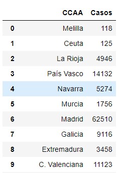
We check the format of the dataframes we are going to work with.
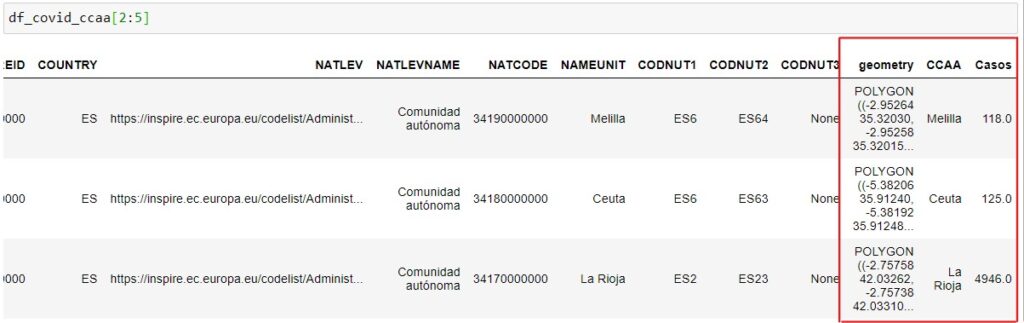
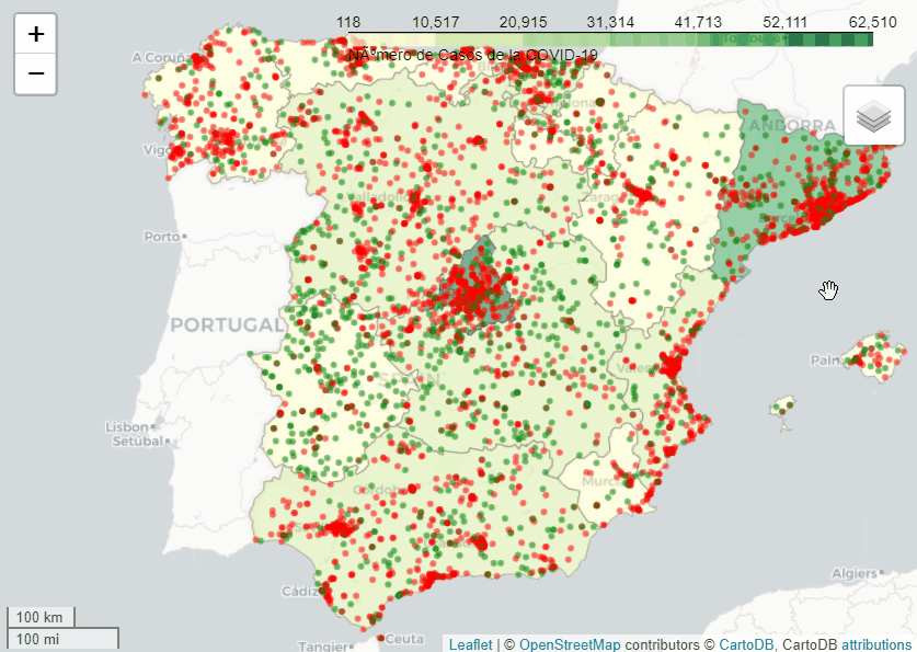
With this dataframe, the data that we will use fundamentally to build the maps will be the columns marked in red. The variable «geometry» corresponds to the data extracted from the geojson file of the different Spanish provinces and that draws the polygon with the shape of the area of the province on the basis of the Folium map of our choice. In addition, we have inserted the name of the province to which the area corresponds and the number of cases diagnosed with COVID-19 by PCR as of April 25.
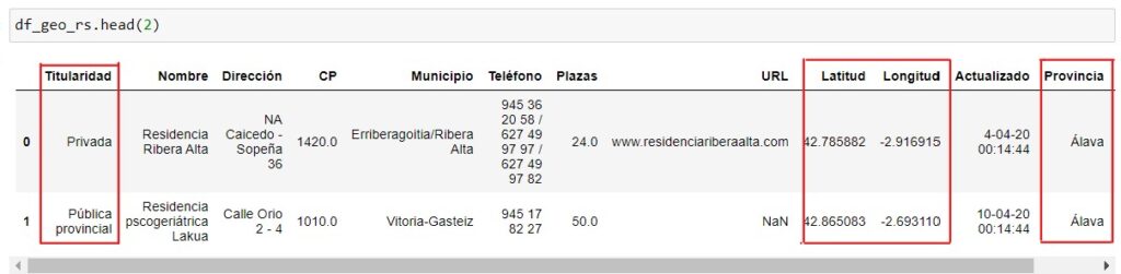
In the second dataframe with which we will work, it will be a list of all existing residences in Spain and their geographical location.
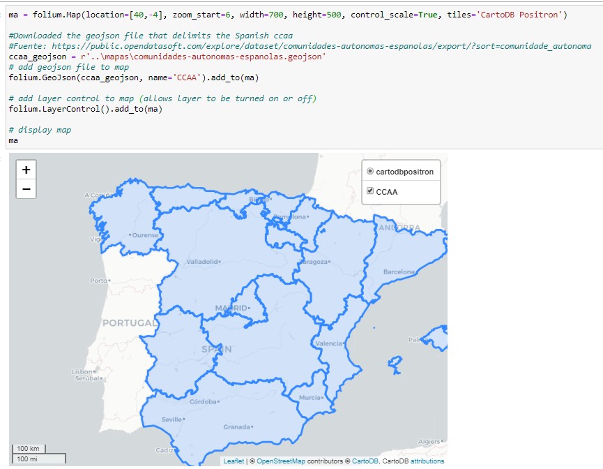
In order to have a better didactic view of how to use the geometry polygons of the provinces, we will import the province data from an online source and treat it to dock it into a base layer of the map of the peninsula in Folium.
There are many resources worldwide with the geographical data of each country, in our case we have downloaded a document in geojson format of the Spanish provinces from the opendatasoft resource.
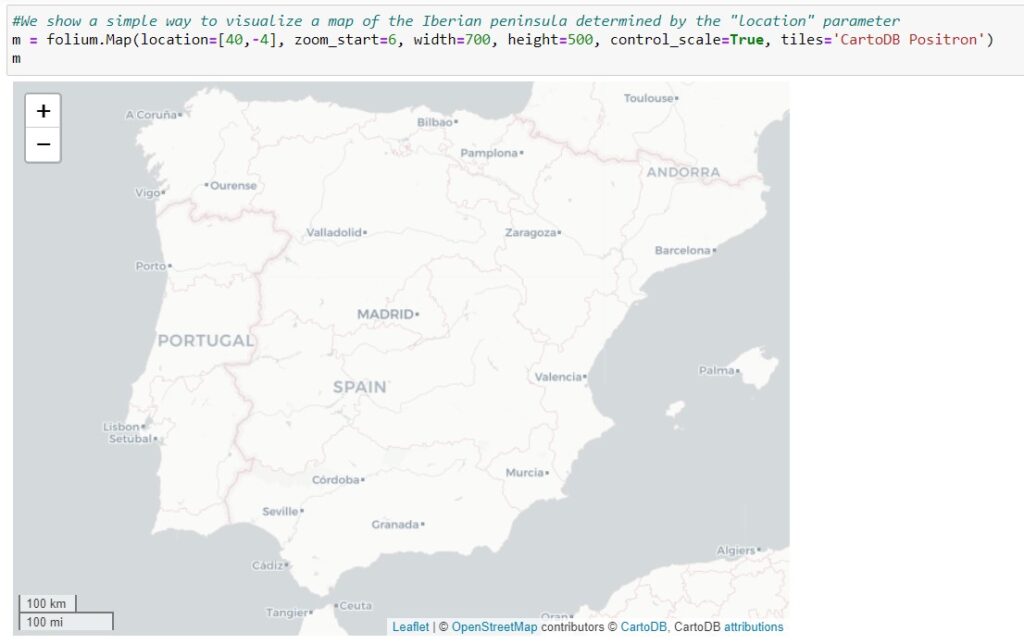
From this point we can start drawing our simple map in Folium.
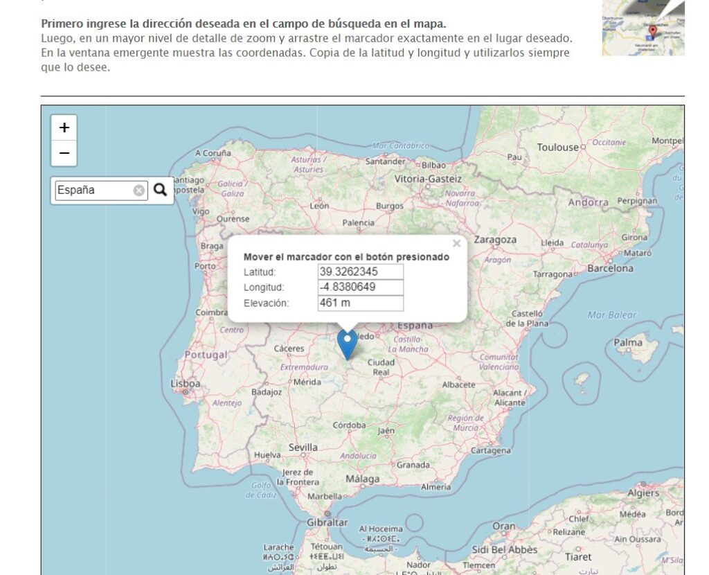
To locate a particular country or area, we must tell Folium the «location» argument with the coordinates where that area is located. To do this, we can help us from some online resources where we put the name of the country, town, etc. and indicate the longitude and latitude that we will use as a reference to focus the map in which we are interested. I usually use a very simple resource but it gives me the information I want for this: https://www.mapcoordinates.net/
We show a first easy way to visualize the map where we can set up the location area with the coordinates selected above, the size of the map and the type of map. At this point, Folium has different mosaics according to its needs. By default, folium uses the openstreetmap tile, but by changing the «tiles» argument you can change the type of base map you want.
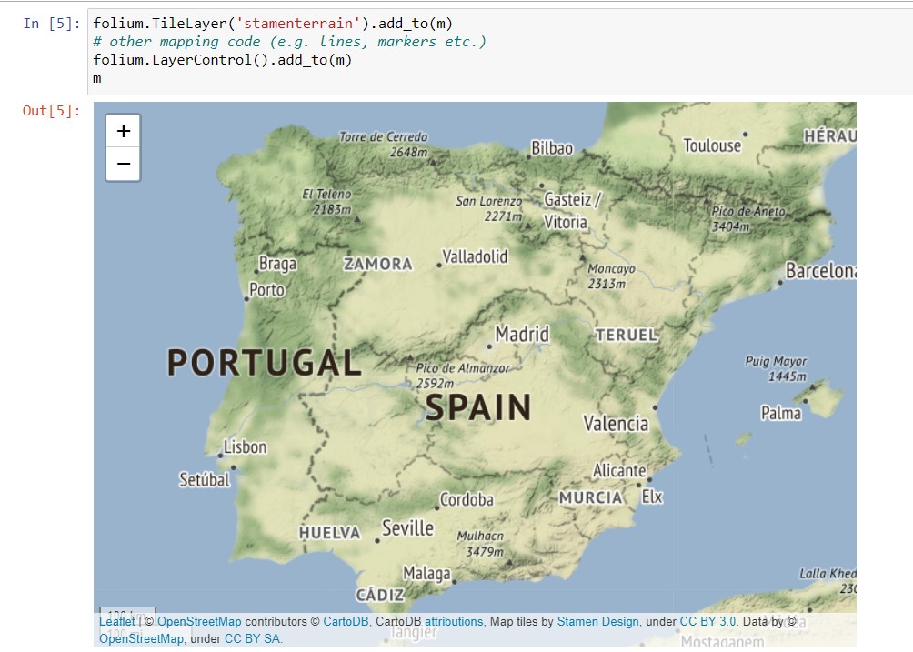
On the other hand, we can add different layers of tiles or kind of maps with the TileLayer() function and then add it to the initially created map variable.
Now on the initial mosaic we can overlay the geodesic polynomials that we need to create our interactive maps, as in our case the regions in which Spain is divided. We performed this away from the downloaded geojson document with the coordinates of the province polygons and using the GeoJson() function and added it as another layer in the original tile.
Choropleth map
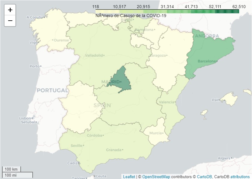
At this moment my interest is to reproduce the interactively capable choropleth map that I developed for the article Analysis of the incidence of COVID-19 in elderly people’s home, with the data obtained from COVID-19 cases by CCAA.
When I faced this challenge, I had difficulty in the regions polygon taking the colours according to the scale. I will mention here what is the critical point to form such maps. On the one hand, we will have the geojson file and on the other a data frame with the data corresponding to each region or CCAA. The important thing at this point is that the data frame has the same CCAA name format as the one listed in the geojson file. To do this, we will extract those names by converting the geojson file to json first to detect the fields for extraction. We’ll make it a list and change the names in the data frame to match exactly. This way you won’t have any trouble getting the polygons to take the set colour scale.
Once we have the data frame with the names of the CCAAs that exactly match those of the geojson file, we can make the map with Folium that has the Choropleth() function that is specific to this type of mosaics.
The key arguments of the function are:
- geo_data: the file will be placed in the converted json format in the variable geojson_counties.
- data: we will put our data frame.
- Columns: the column of the CCAAs names that have to match the names of the json file and the “Cases” column that will be used to make the colour scale will be indicated.
- key_on: It is perhaps the most complicated parameter to interpret or at least that I had a harder time interpreting. This is the path of the json file (geojson_counties in my case) from which the names of the CCAAs that must match the name of the column ‘CCAA’ of the df_datos will be extracted. To extract that path, you must read the json and check the path. In the top code, I have put an example to get ‘Balearic Islands’, hence the path is extracted, in our case feature.properties.text.
The other parameters are for the colour palette format (see this link to get an idea of the variety of colour palettes), line colour, name, etc. With those values, you can play until you get some colours that fit your data. We get this map, where the communities with the most confirmed cases of COVID-19 to April 25, 2020, were Madrid and Cataluña.
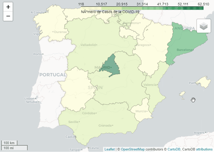
The next step will be to add an interactive label layer with the data from each region to the map.
The interactive map will look like this:
Our finish goal is to get the map that was made in the mentioned article, overlaying another layer with the geopositioning of the residences on the choropleth map in two colours those centres that are public from the private. We have the data frame with the coordinates in two columns Longitude and Latitude and the type of residence along with other data. We achieve this by calling the data frame using the apply function of pandas and lambda for each geographic point of the residence and drawing a point using the folium function Circle(). We previously added a function to change the colour based on whether it is private or public in the corresponding column of the data frame.
As you can see, we have an interactive map with the color density by regions in Spain based on the confirmed cases of COVID-19 and geographically positioned the residences according to their public ownership (green) or private (red).
For more details of the code you can consult the project on Github. 


Genial, gran trabajo. Intentando reproducirlo.