Time series is one of the most commonly used data types to measure our human and economic activity and could be defined as a collection of observations of a variable collected sequentially over time. Stock prices, sales, climate data, physiological measurements such as our weight or temperature, or others such as energy consumption, on which we will base this article, are just some of the examples of data that are measured at regular time intervals. Most data scientists have encountered the challenge of analyzing data in the form of time series and being able to handle it effectively is a skill that must be present in our «toolbox».
In this article we will discuss with an example of predicting the demand for energy in homes to start playing with time series in Python, using for prediction a couple of models of the most used such as Prophet (Facebook) and Recurrent Neural Networks using Long Short-Term Memory (LSTM). Before applying the models and especially in the time series, some data manipulation is necessary to use them in supervised models, so we don’t have a separate variable as such, but must be generated to apply the models to it.
In this article, you will learn about an approximation:
- Exploratory analysis of time series data and trend visualization and seasonality.
- An approximation to feature engineering in time series.
- Preparation of data for supervised models in time series.
- Application, analysis and comparison between Prophet and LSTM models.
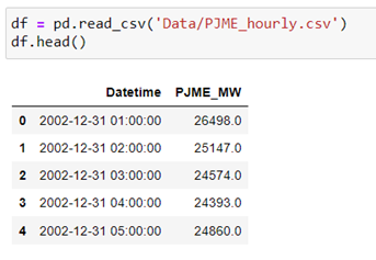
Without further ado, we start by loading the libraries and data that we are going to use. In this case, these are energy consumptions per hour in megawatts (MW) collected by PJM (Kaggle) which is a regional energy marketing organization in the several East States of the United States.

We upload the data from the csv feed available in Kaggle.
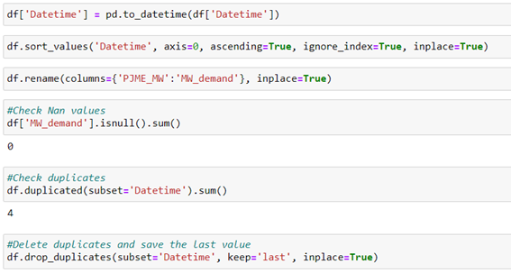
We carry out a pre-preparation of the data:
- Convert the variable «Datetime» to the DateTime format of pandas.
- Sort records from oldest to most current.
- Rename the energy column as «MW_demand».
- Check and remove duplicates in »Datetime».
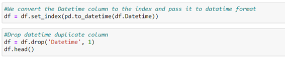
In the case of time series it´s advisable to observe whether there is continuity in the time frequency determined by the index or if there are other cuts that may impair continuity in the time series data, which can result in a loss of information in subsequent predictive models:
- To do this, we select the variable «Datatime» as the index and change the data type to Data time again.
- We check your frequency. If the data has a constant frequency, df.index.freq will be True, if not (for example, if a few days are missing from the data frequency), df.index.freq will be None.
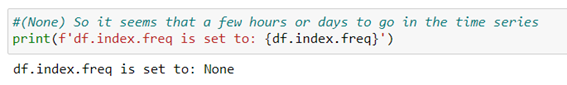
As we can see there isn´t constant frequency, therefore, we will have to fill it with data to achieve continuity in the frequency of data. To do this, we fill in the missing values of the dating frequency with average values. We generate a custom date range or frequency between our minimum and maximum dates in our index. From here we compare with our index and check which intervals are missing.
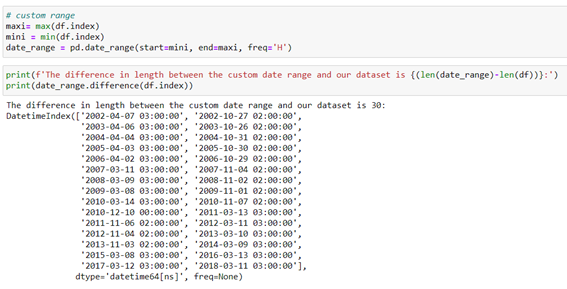
We can see that 30 dates/hours data is missing in which there´re no records. Now we fill the ranges of those 30 missing dates/hours in our df with average values. To do this we use the data_range variable that we have generated as a new index of our df.
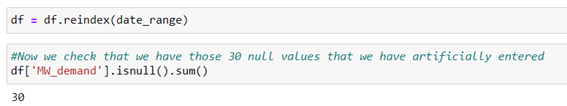
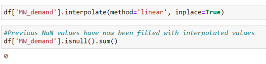
Next, we fill in those 30 values with mean values from the linear interpolation technique between the two consecutive values. And we check that all 30 null values have been populated.
We visualize what the time series would look like now that we have all the df data:
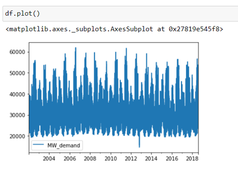
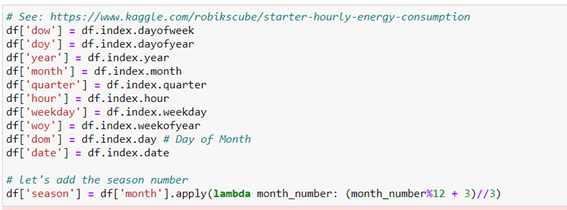
With this chart, it is difficult to appreciate the internal trends or seasonalities that it has each year or even the general trend of energy consumption over the years. It will be advisable to generate new time variables using feature engineering in order to better appreciate these details.
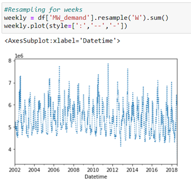
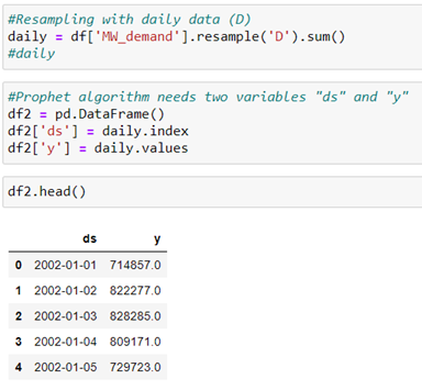
With these new variables, we can visualize the data according to time groupings. For example, we can do a resampling for weeks:
You can group energy consumption by hour of the day and day of the week and visualize the trends.
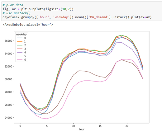
Knowing that the number 0 corresponds to Monday and 6 to Sunday, it can be observed that between Sunday and Wednesday are t he days of the week that the greatest demand for energy production. Being around 20:00 hours, the peak of greatest need for energy in a medium day.
We make an observation of energy consumption during the hours of the day according to the season of the year.
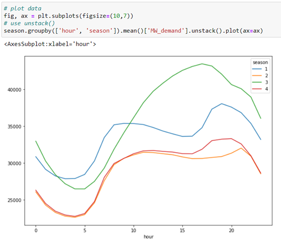
Considering that the number 1 corresponds to winter, 2 to spring, 3 to summer and 4 to autumn. It is appreciated that the demand for higher energy occurs around 18:00 hours in the summer season, presumably due to the consumption made by the air conditioner. Followed by winter and with less energy demand per day, it occurs in spring and autumn as they are warmer times.
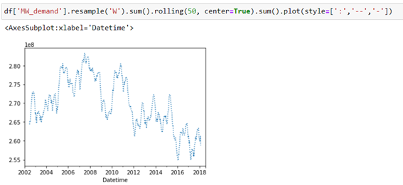
When you do a weekly resampling with a 50-week time window you see a tendency to decrease energy demand in recent years.
Let’s break down the time series data into trend and seasonality, using the seasonal_decompose of the statsmodels library.
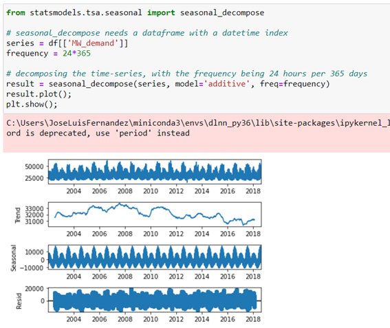
As mentioned above, there´s a tendency to decrease energy consumption over the years and clearly there´s a seasonality in consumption by having a peak energy demand that is repeated annually coinciding with summer.
Model prediction
Once we’ve explored the data and had a general idea of its behaviour, we’re going to apply two of the most commonly used models in time series such as Prophet and LSTM.
Prophet

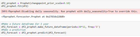
Facebook Prophet was released in 2017 and is available for Python and R. This library is designed to analyze time series with daily observations that display patterns on different time scales. Prophet is robust in the face of missing data and trend changes, and usually handles outliers well. Prophet is probably a good choice for producing quick forecasts, as it has intuitive parameters that can be adjusted by someone who has a good knowledge of the domain but who has fewer technical skills in forecast models.
We train the model and predict the data for 1 year.
We visualize the time series and the prediction made.
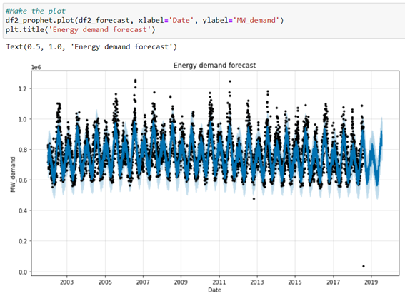
Black points represent the actual consumption, and the blue line represents the prediction made by the model. It can be observed that the prediction conforms to the actual values, although the prediction could be improved since it´s seen in the graph that there´re at least two points with outliers that we should change to average values to check the influence they may have on the final prediction. Another interesting analysis would be to try to limit 5 years of data back to 5 years to avoid past trends, as we have seen that in the long term there´s a tendency to decrease energy consumption.
LSTM prediction
Long Short-Term Memory neural network has the advantage of learning long sequences of observations, although it´s somewhat more technically complicated to adapt the data for use.
I don´t stop to explain the concepts behind the LSTM, for this you can consult the blog article, «Understanding RNN and LSTM«, which explains in a simple way the main concepts that are behind the recurrent neural network and the LSTM.
Here we will try to apply it in a practical way. So let’s start by handling the data to suit the needs of this neural network.
Standardization
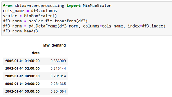
LSMs are sensitive to the scale of input data, specifically when using sigmoid or tanh activation functions. In general, it´s good practice to change the scale by normalizing the data to the range of [0, 1] or [-1, 1]. We can easily normalize the dataset using the MinMaxScaler preprocessing class of the scikit-learn library.
At this point I found a problem importing the sklearn module since when I previously installed keras and tensorflow, I had an error:
>cannot import name ‘moduleTNC’ from ‘scipy optimize’
To fix this you have to rename a file in the path where the sklearn library is located (in my case in Miniconda) in the running environment (in my case dlnn_py36):
>…\miniconda3\envs\dlnn_py36\Lib\site-packages\scipy\optimize
So the file named «moduletnc.cp36-win_amd64.pyd» is renamed to «moduleTNC.cp36-win_amd64.pyd». With this operation, the library returns to work in an environment where tensorflow 2.0 and keras 2.3.1 have been previously installed.
Split the dataset into training and test
In other models we use the typical sklearn object by calling model_selection.train_test_split, but in the case of time series we can´t randomly split this dataset, as the data stream is temporarily essential for capturing patterns by the model. However sklearn has another time series-specific object such as TimeSeriesSplit, however from my point of view it´s easier to generate our own custom function to split this type of data.
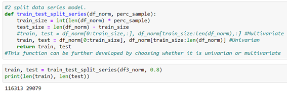
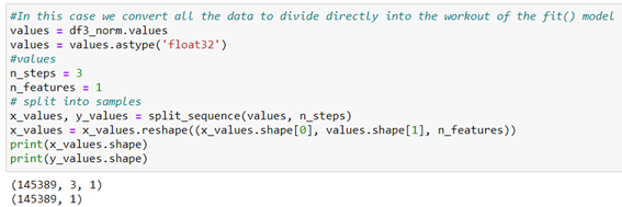
Our data are univariate, but this function could be improved to further generalize it by including an option for multivariate data. It would be pending to develop that part of the function, so if any are encouraged, leave it in the comments…😊
Becoming a supervised learning problem
As we said at the beginning of the post, in time series data There isn´t target variable as such to apply a supervised model, so, in a recurrent neural network, we will have to generate that variable. This explains this very well in this article: «How to Develop LSTM Models for Time Series Forecasting» from which we borrow the split_squence() function they develop in it.
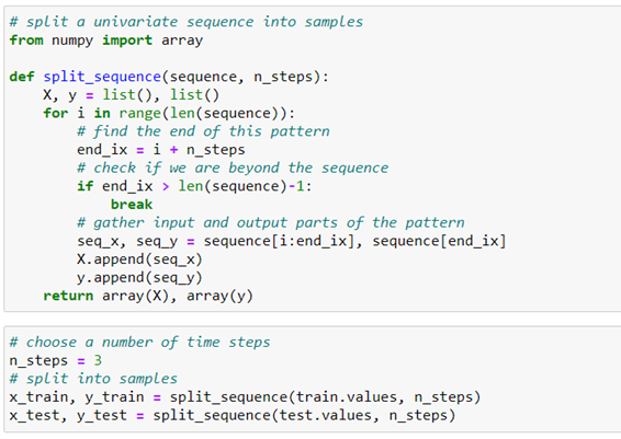
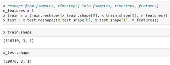
The split_sequence() function generates an array in the form [samples, timesteps] but as in LSTM it must be fed by 3D samples [samples, timesteps, features], we must modify the array so that it has an additional dimension for univariant data as is our case.
Therefore, we pass the array formed by the function Split_squence(): [samples, timesteps] >> [samples, timesteps, features] using the reshape object:
Once we´ve prepared the data in the training and validation arrays, let’s define the model.
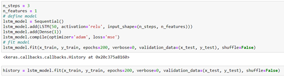
The variable «history» will serve to store in a dictionary the history of the values of the loss and precision function to optimize the model during training.
Then with this variable, we can use the data collected to create graphs that can indicate the speed of convergence between the training and test data or the possible model´s overfit. For more information on history in Keras you can consult this article.
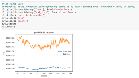
From the loss plot, we can see that the model has an overfit performance since there´s a minimum loss that then starts to go back again. A chart is created that shows the characteristic turning point at the loss of validation of a model that is overfitted. At this point and as shown in the graph, we should decrease the number of passes by around half (epochs=100) to decrease the loss.
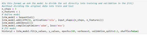
Therefore, we re-train the model by halting the number of laps (epochs). In addition, we will leave directly to the model that divides the entire Dataset into training and test. This part would not be necessary, but to verify that there´s this simplification of the configuration, if we don´t want to divide the Dataset manually as we had initially done. To do this we directly divide all the data from the normalized dataframe above.
We train the model with 100 full laps.
And we check the loss chart again.
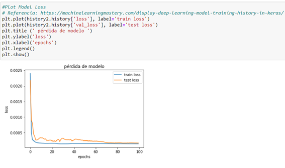
A good fit occurs when model performance is good in both the training and test sets. As in this case, a good fit can be diagnosed from a section where the training set and the loss of the test set decrease and stabilize around the same point.
Prediction
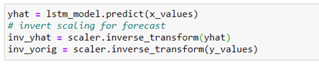
With the trained model, we make the prediction of all the data and take it to its previous scale to be able to compare it, since we had standardized the data before.
Visualize the actual data with the prediction
To see how model prediction behaves against actual data, let’s chart the time series in both cases in a given period (200 first records).
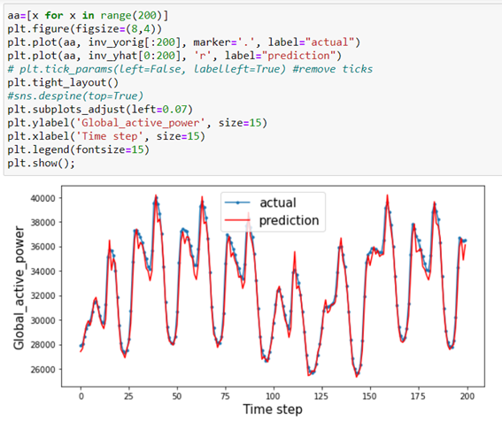
In this time window, a good prediction of the data appears to be displayed.
Conclusion
In this post, we have been able to approach the prediction of time series using two models of the most used for this type of data such as Prophet and LSTM.
In both cases, initial preparation of the data is required, to have the appropriate formatted date in the dataset index and populate the missing values.
Prophet is useful for a quick approach to the problem, being very easy to handle, predict and display the data.
LSTM is able to take more accurate information, but requires prior preparation of technically somewhat more complex data.
For more information and details, you can consult the project website at Github